

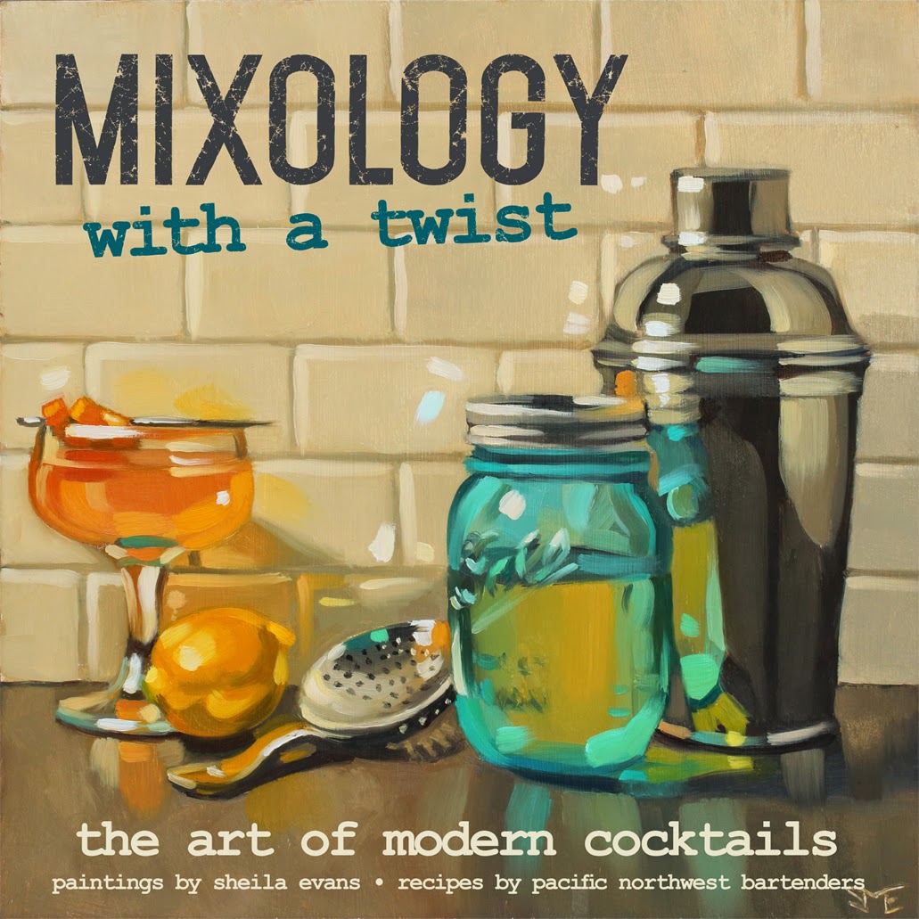
Mixology With a Twist. Oil on panel, 12" x 12". Sold.
With a few solid drink paintings done, starting the design phase of a book amps up the motivation. It can also feel like a scary blank canvas. The goal for the new book is to feel fresh and modern, but what would that look like?
A visit to a free font site started the ball rolling. Okay. Lots of tall, modern display fonts tied nicely with the last book's art deco titles. How about pairing that with a typewriter font to reflect all those cocktail menus I've seen? And how about giving that a nice distressed texture to give it that old-as-new feel of modern cocktail bars?
With that roughly settled, it was time to think about the cover. I knew I wanted the whole cover to be a painting this time, but that would be tough with one of the existing images. The only thing for it was to create a painting specifically for the cover, leaving room for the title and subheadings. So I worked backward, designing the text portion first, then creating a still life to fit it.
Here's the mockup:

Even with the mockup cover printed out and clipped to the easel, it still felt like winging it. I didn't trust that the proportions would work exactly as planned. But in the end, I'm pretty happy with the result. The painting, which (hopefully) hints at the creative nature of modern bar tending, fit just fine. With the cover as a launch point, the page design almost falls into place. Feeling accomplished!
Here's the completed cover (subject to change of course):
No comments:
Post a Comment