Thursday, March 26, 2015

Accordance Cocktail

online
Accordance Cocktail. Oil on panel, 12" x 12".

A delicious drink, a sunshine-filled distillery, and Seattle in springtime: it doesn't get much better than this! As I mentioned in my last post, we stopped in at Sun Liquor in Seattle several weeks ago. I ordered an Accordance and fell in love.

I tried to capture the afternoon in this painting, and with extra inspiration from their website, give it a Sun Liquor feel. 

Planning ahead, I grabbed a coaster from the bar and took a photo of the cool, pentagonal-based glass. I thought it would be no problem to find a similar glass, since it appeared to be new. Not so much. The glasses were available—from the UK, by the case. That was not gonna happen. Instead, I found a similar-ish Libbey glass and made a painting. Meh.

Then, a dangerous discovery. A search for "vintage cocktail glass" on Etsy brought up 146 pages of listings for every imaginable glass, including exactly one listing for a pair of silver-rimmed, hexagonal-based, mid-century beauties. I ordered them immediately, dooming myself to yet another painting do-over. (Obsessive much? Right?) And as if that wasn't bad enough, the glasses were tiny, so I recreated the coasters to scale with an ink jet printer and card stock. 

Obsessiveness and scale issues aside, I'm finally happy with the painting and excited to see it in the new book. That's all that matters, isn't it?

Wednesday, March 18, 2015

Pulse Wave

online
Pulse Wave. Oil on panel, 8" x 8".

Last month we spent a gorgeous sunny afternoon in Seattle, in part, appropriately, at Sun Liquor. Their beautiful, retro-inspired cocktail bar adjoins the distillery. The menu boasted so many amazing-looking cocktails, I had to ask for help to decide. I decided on the Accordance, a boozy, bourbon-based drink that I loved. But Sun Liquor doesn't make a bourbon.

I picked up a card for bar manager Eli Hetrick, asking for the Accordance but also (or instead) for a drink that actually used Sun Liquor. He generously came through on all counts, sending me the Accordance and a personal favorite of his, the off-menu Pulse Wave. Taking inspiration from Sun's cool bar, amazing vintage barware collection and beautiful website, I sketched out an idea and painted away.

The problem was, I hadn't had the drink yet. The night I finished the painting, I made the Pulse Wave and realized my painting was not worthy. The drink was far prettier than my prop drink, and it was too good for my slightly muddy, overworked panel. So today I set everything up again and (I hope) did it justice.

Oh, by the way, the Pulse Wave is sort of like an Aviation crossed with a Negroni, with grapefruit. 

Here's my view from the bar of Sun's vintage barware collection:


Tuesday, March 10, 2015

The Anton Boxrud

online
The Anton Boxrud. Oil on panel, 12" x 12".

Last week was a bit panicky, as the list of unpainted cocktails had shrunk to almost nothing. I enlisted a few members of the tasting gang and headed out for happy hour. First we hit Clover, looking for a bartender who had agreed to contribute a recipe. Unfortunately, she had left early to pick up a sick kid. Not willing to waste a perfectly good happy hour, we tried some tasty drinks and got a few leads (we'll be back!). 

Then it was on to Ruins, where Kelli Aspen Green greeted us from behind the bar. Just about every bartender in town had recommended I get a recipe from Kelli. She did not disappoint, immediately offering a delicious original creation and a story to go with it. 

Asked by mutual friend Sylvia (original owner of Mizuna) to create a drink, Kelli came up with this tasty concoction on the fly. Sylvia fell "instantly in love" with the drink. So Kelli decided to name it for the place where she first fell in love, the Anton Boxrud bed and breakfast in Salt Lake City. Kelli wrote down the story for me, offering that it was the place where she left her virginity. "Do you want that in the book?" I asked, and received an enthusiastic "yes!" So there you have it.

This drink is pure herbalicious refreshment, with a gin base, lime, fennel simple syrup, celery bitters and a rosemary garnish. Best of all, every ingredient is available in Spokane! At last!

Friday, March 6, 2015

Black Beer'd

online
Black Beer'd. Oil on panel, 12" x 12".

There's not much to this painting, as number of props goes. Yet it required the single longest setup of any painting I have done. For the first time, I devoted an entire day to the composition of essentially four objects. I've heard of people taking days to arrange a still life, but honestly, I thought that was crazy talk. Okay, now I get it.

I shouldn't complain. I'm sure it took at least that long for regular taster and perfectionist Richard Vander Wende to finalize the Blackbeer'd recipe itself. Every ingredient was crucial down to the proof (Navy strength, naturally). His efforts paid off—the drink is fantastic. Then, not content to just jot down the recipe or send it in a text, he presented it as a beautifully designed art piece. It featured an antique etching of Blackbeard after a sip of his fabled favorite beverage: rum topped with gunpowder. 

Fortunately for us, Richard opted to top his drink with Oskar Blues Ten FIDY imperial stout instead.

Now, how to put all of this in a painting: an essentially dark drink, the etching, and hopefully something that would tie it all to Richard. The Vander Wende house is filled with art, some of it in elaborate filigree frames. I had a lesser version of one of those, which gave me the idea to incorporate the etching, which would contrast with the drink. Then it lacked color, so in came the cranberry glass with the skewers (which reminded Kate V.W. of swords, perfect!).

Almost there, but not quite. No imaginable cocktail shaker complemented this arrangement. Enter the beer bottle, despite Oskar Blues canning all of their beer.  Just another several hours of raising and lowering all of the props and figuring out how to "frame" the frame, and… eventually… wait for it… voila!

Richard making Blackbeer'ds for the gang:


Monday, March 2, 2015

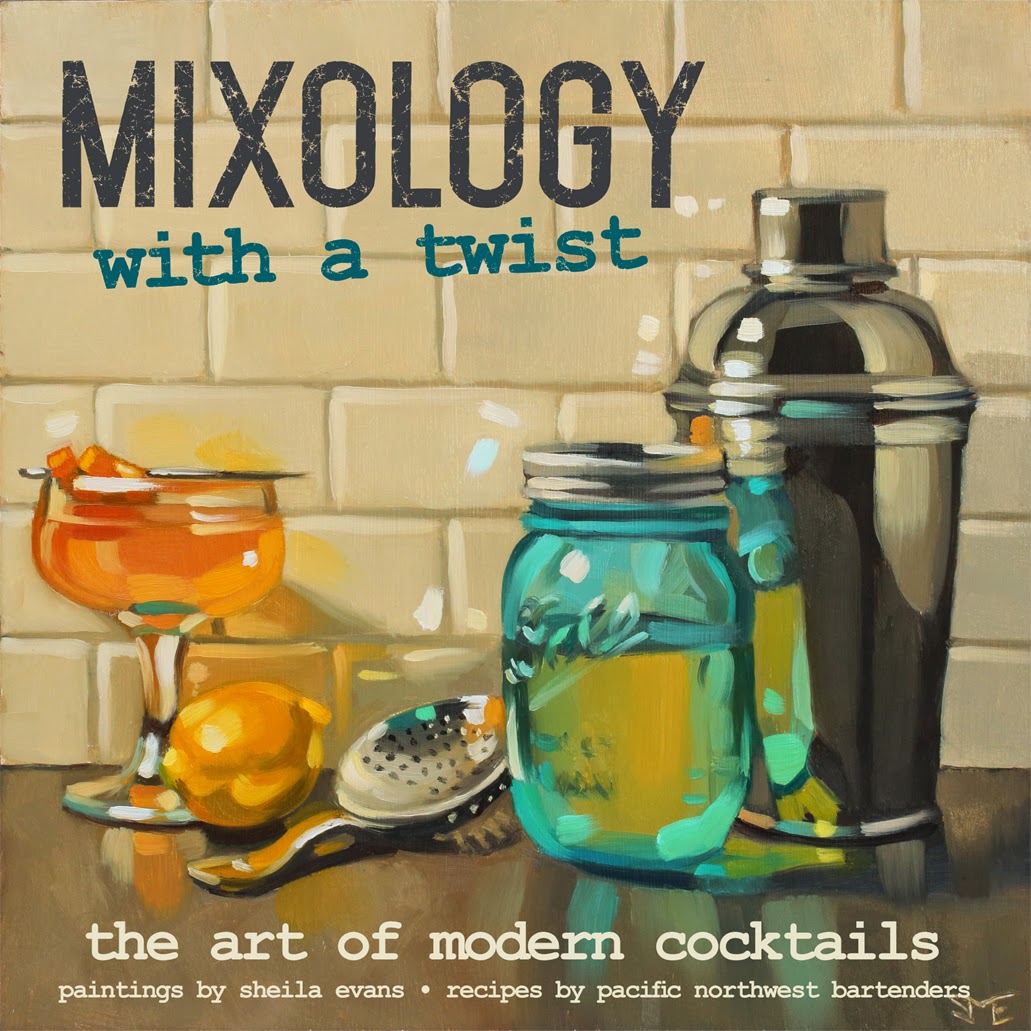
Mixology With a Twist

Mixology With a Twist. Oil on panel, 12" x 12". Sold.

With a few solid drink paintings done, starting the design phase of a book amps up the motivation. It can also feel like a scary blank canvas. The goal for the new book is to feel fresh and modern, but what would that look like?

A visit to a free font site started the ball rolling. Okay. Lots of tall, modern display fonts tied nicely with the last book's art deco titles. How about pairing that with a typewriter font to reflect all those cocktail menus I've seen? And how about giving that a nice distressed texture to give it that old-as-new feel of modern cocktail bars? 

With that roughly settled, it was time to think about the cover. I knew I wanted the whole cover to be a painting this time, but that would be tough with one of the existing images. The only thing for it was to create a painting specifically for the cover, leaving room for the title and subheadings. So I worked backward, designing the text portion first, then creating a still life to fit it. 
Here's the mockup:

Even with the mockup cover printed out and clipped to the easel, it still felt like winging it. I didn't trust that the proportions would work exactly as planned. But in the end, I'm pretty happy with the result. The painting, which (hopefully) hints at the creative nature of modern bar tending, fit just fine. With the cover as a launch point, the page design almost falls into place. Feeling accomplished!

Here's the completed cover (subject to change of course):